NATO
A credible, independent brand identity for the NATO Innovation Fund.
Built fortrust
NATO Innovation Fund needed a brand as credible as the institution behind it.
We built the full identity system for NIF (logo, colour system and brand guidelines), designed to sit comfortably alongside NATO's own mark while standing as a serious, independent brand for a fund investing in deep tech and dual-use innovation.

Independent,but aligned
NIF needed to feel independent from NATO, without ever feeling disconnected from it.
As a newly formed innovation fund, NIF needed a brand serious enough for institutional partners and investors, distinctive enough to stand on its own, and disciplined enough to sit naturally alongside the NATO name wherever the two appeared together.

A mark built tonavigate
The compass at the centre of the mark sets the tone for everything else.
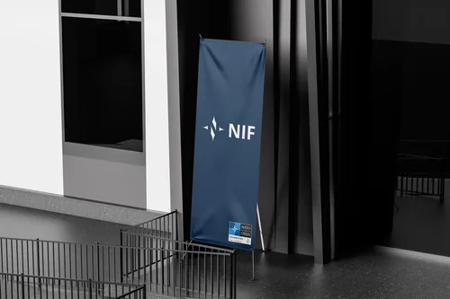
A four-point compass mark gives NIF a distinct, ownable symbol independent of NATO's own insignia, while a disciplined navy, blue and grey palette keeps every touchpoint, from business cards to the annual report, instantly recognisable. We built out a full guidelines system so the identity could scale cleanly across print, presentations and the web.

Ready toinvest
NIF launched with a brand built to be taken seriously from day one.
The identity now carries NIF across every touchpoint, from the annual report to conference signage, giving the fund a consistent, credible presence wherever it shows up alongside NATO.

