Burn Or Learn
Branding and platform UI for a climate network that turns online action into real-world impact.
Burn orlearn
A platform ready to launch, and a brand that wasn’t.
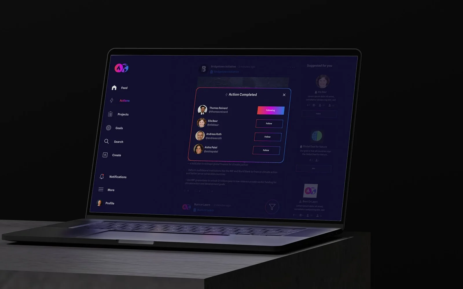
Burn or Learn is an action-driven social platform where individuals, organisations and governments create, manage and join projects that turn online action into real-world impact. We built the identity from the ground up (logo, palette, typography and a full set of guidelines), then designed the platform’s interface for desktop and mobile.
Before thebrand
It worked. It just didn’t look like it meant it.
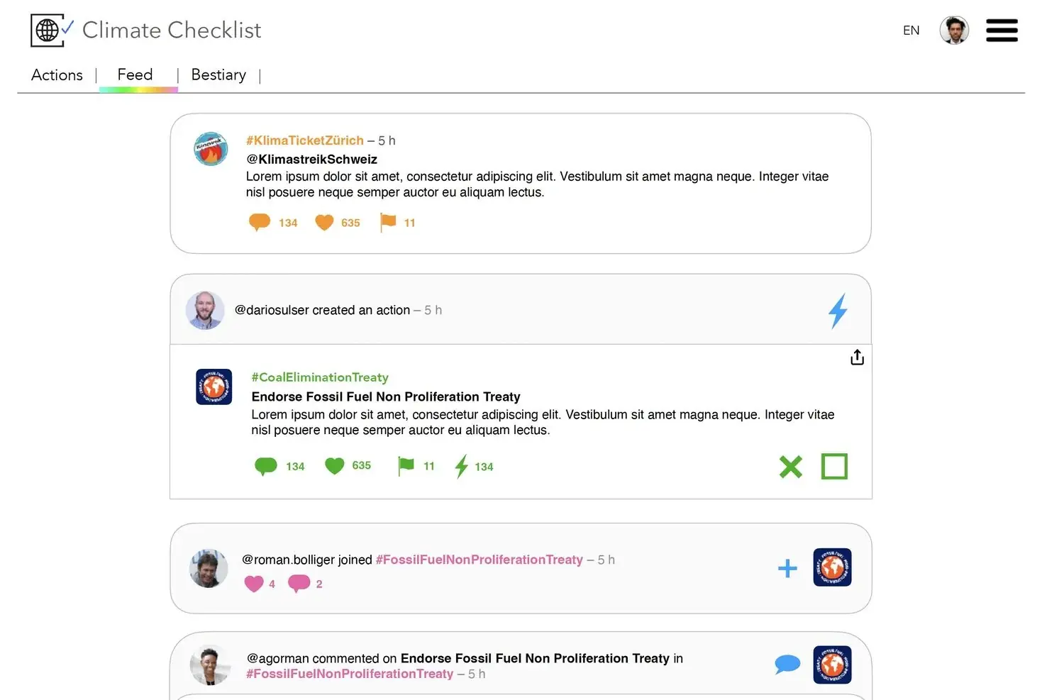
The product existed as Climate Checklist: a working prototype in default system type, white cards and placeholder copy, with icons borrowed from four unrelated colour families and a rainbow rule standing in for an identity. Nothing on the screen told you this was about the climate, or gave anyone a reason to care.

Make itmatter
Climate action is a crowded, worthy space. This had to feel like neither.
The brief was an identity with enough edge to cut through the beige of environmental branding, and a platform interface that made taking action feel immediate rather than administrative: bold, optimistic and a little confrontational, working as hard on a phone as on a desktop.

Built toburn
Two circles, one gradient, and a name that states the stakes.
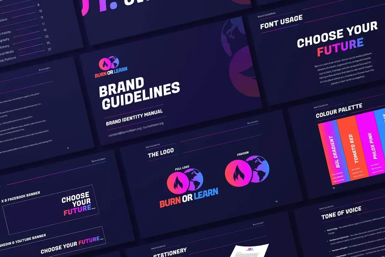
The logo sets a flame against a globe as overlapping circles, joined by a gradient running tomato red through phlox pink into blue: fire on one side, the planet on the other, and the choice in between. That gradient became the brand’s signature, carried across the guidelines, stationery and social, with “Choose your future” as the line holding it together.
For the platform we moved the interface onto a deep navy canvas so the gradient does the signalling (actions, reactions and project states all read at a glance) and designed the feed, project pages and profiles for mobile and desktop in parallel.

Choose yourfuture
A climate platform that looks like it intends to win.
Burn or Learn has a complete identity system (logo, palette, typography, guidelines, stationery and social templates) and a platform interface designed for both screens, ready to put in front of the individuals, organisations and governments it was built for.

