Nutree
Brand, packaging, website and marketing advice for a brand-new UK medical cannabis pharmacy that had to earn trust from day one.
Healthcare,not hype
A new pharmacy in a new market needed to look like healthcare, not cannabis culture.
Nutree is a London pharmacy for plant-based medicine, including medical cannabis, run by a team of doctors and pharmacists. They came to us with nothing in place: no brand and no website. We created the brand, designed and built the website, and advised on their marketing from launch.
A newmarket

Medical cannabis had only been available on prescription in the UK since November 2018, and most people still didn't understand it.
Some still don't condone it. Nutree was starting from scratch in a sector full of stigma, where the obvious visual clichés would have alienated the very patients, families and doctors they needed to reach.


Trustfirst
Look like a pharmacy, not a weed brand.
The brand had to be professional and medical enough to win the trust of patients and prescribers, without feeling cold or clinical, and without the clichés that put large parts of the audience off. The website had to be easy for worried first-timers to use and make getting expert advice simple.

Calm,credible
A friendly brand with its medical credentials up front.
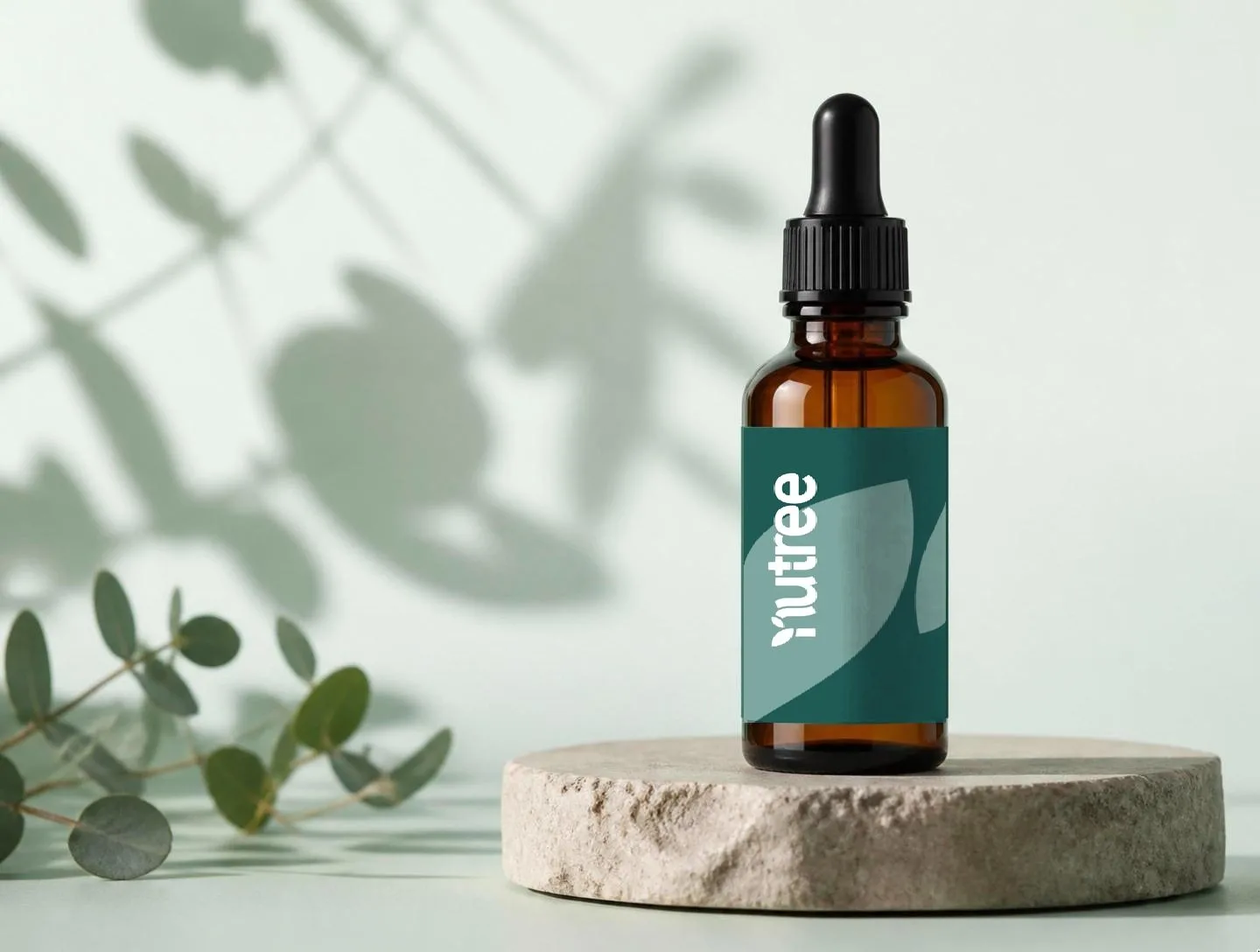
We kept green, familiar from both pharmacies and medical cannabis, and paired it with a soft, rounded wordmark whose 't' doubles as a medical cross. The same leaf shapes carry through to the packaging, so the dropper bottles feel like a pharmacy product, not a lifestyle one. The website puts Nutree's credentials front and centre, and we advised them to register with all the official bodies to help build trust. A Book a consultation button means worried patients can speak to a qualified practitioner straight away, and a simple four-step journey explains how it all works.


Built ontrust
Nutree launched as a pharmacy patients could trust.
A brand that feels medical but approachable, a website that turns questions into consultations, and a marketing plan built on education: our consultation sessions focused on an extensive blog and guides to help people understand medical cannabis.